Digital marketing and the nitty-gritty can feel like learning new vocabulary. Among other jargon, one term you’ll hear a lot is ‘landing page.’
So, what exactly is a landing page, and why is it so important?
Simply put, a landing page is a dedicated webpage to capture visitor information and encourage a specific action, such as a purchase.
They work great for paid ads, product launches, or promotions. It’s a crucial part of your digital marketing strategy. Because this is where you convert website visitors into leads or customers.
Let’s show you why your business needs one and how to create it!
What is a Landing Page?
A landing page is any web page a visitor can land on after clicking an ad or link. In marketing, it’s usually a standalone page with one clear focus.
It’s meant to fulfill a promise made in your content. Unlike regular pages, it isn’t for research or browsing. The key details of your offer or service appear on this page.
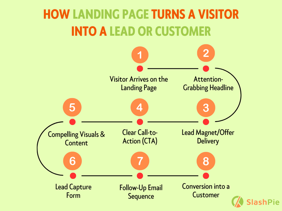
Landing pages help guide potential leads through your conversion funnel. Once visitors click a CTA or ad, your landing page drives them toward action.
It’s easier to engage prospects here and turn them into customers. You can offer something valuable, like a deal or info, in exchange for contact details.
Difference Between Landing Page vs. Regular Webpage
Landing pages are different from regular web pages. They target specific customer segments, unlike a homepage or service page.
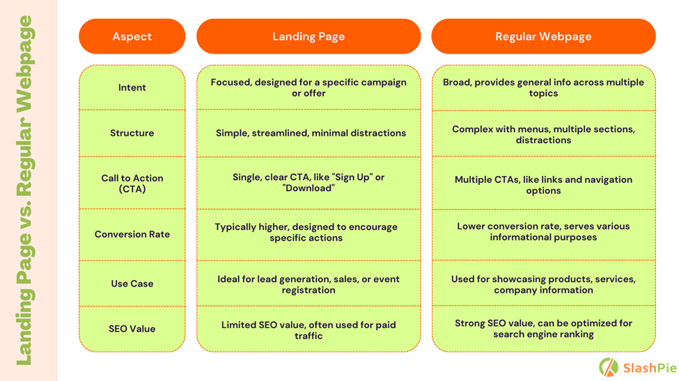
Landing pages focus on driving one action from visitors. Actions could include signing up, downloading, or scheduling an appointment.
They aren’t linked to site navigation, which keeps users focused. The goal is simple: convince visitors to act quickly.
What Are The Key Benefits of Landing Pages?
There’s no denying that landing pages are crucial for boosting your business’s online presence. Plus, they provide a focused space for conversions, and drive specific actions from visitors.
Boosts Conversions
Landing pages are focused on one goal: turning visitors into customers. They remove distractions and guide users to take action.
Here’s some data that speaks for landing pages:
- Landing pages with clear CTAs convert 42% more. (Hostinger)
- Shorter pages with concise messages outperform longer ones by 13.5%. (Hostinger)
- Adding social proof can increase conversions by up to 34%. (Sender)
It convinces users to take action with persuasive copy and strong visuals. Plus, user-friendly layouts and clear calls to action make it easy to convert.
Capture Leads and Grow Email Lists
Studies show that businesses with more landing pages see a HUGE increase in leads. In fact, companies with 10-15 landing pages see a 55% increase in leads.
But how landing pages achieve this?
Landing pages capture leads, offering valuable incentives. These can be eBooks, discounts, or free trials. Visitors provide their email in exchange. This builds your email list quickly.
Personalized landing pages can boost lead generation by up to 202%. Clear and compelling CTAs guide visitors to sign up.
Social proof, like testimonials, increases trust and sign-ups. Simple, focused designs reduce distractions, and ultimately improves lead capture.
Target Specific Audiences
Landing page lets you tailor your message for different audiences. You can create multiple landing pages for different user segments.
Think of your landing page as a personalized invitation. It means each page speaks directly to targeted user needs.
So, use clear and concise language that resonates with them. Tailor your message to audience interests and goals.
Include strong visuals that complement your text and grab attention. A well-designed landing page creates a positive first impression.
Test different versions of your landing page to see what works best. Try A/B testing to optimize for maximum conversions.

Types of Landing Pages
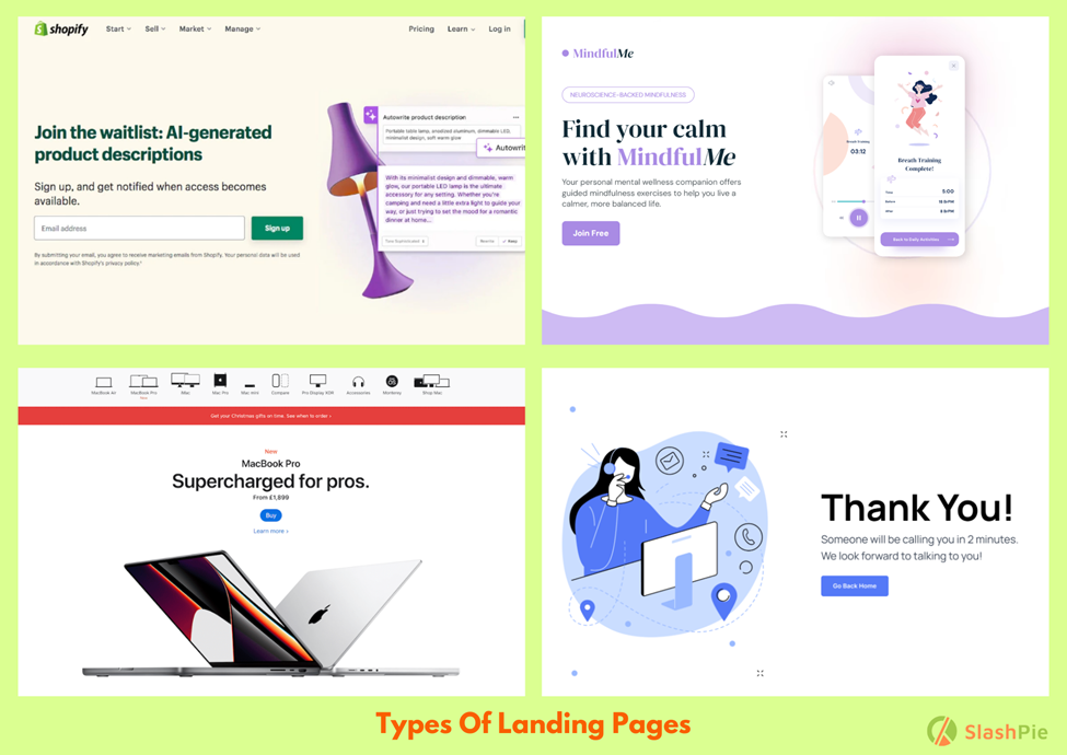
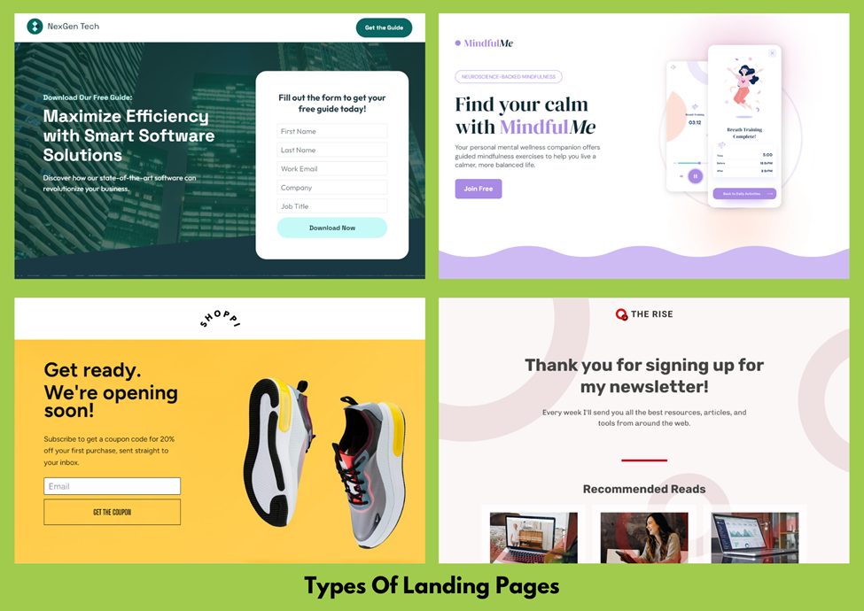
There are several types of landing pages that serve different purposes. Each type focuses on a specific goal to aid your business growth.
Lead Capture Pages
Let’s say you’re offering a free eBook. Visitors want it, but you need their email first. A lead capture page makes this easy. It promises value in exchange for contact info.
Click-Through Pages
Click-through pages guide visitors from an ad to your main site. These pages provide more details and a clear path forward. No confusion, just smooth transitions and higher conversion.
Product Launch Pages
Launching a new product? You need to create buzz. Product launch pages do just that. They showcase your product’s features and benefits.
Visitors get excited and are more likely to buy. They typically include details about the product, pre-order options, and countdown timers.
Thank You Pages
After someone signs up or makes a purchase, what’s next? Thank you pages step in here. They confirm the action and offer more engagement.
Maybe a discount on the next purchase or a share button. It’s a way to keep the conversation going and build loyalty.
Splash Pages
Usually the first page visitors see, splash pages, provide a simple message or ask a question before leading to the main site. They often promote special offers or announcements.
Why Your Business Needs a Landing Page
A landing page is like a digital billboard to grab attention and drive conversions. It helps convert visitors and run targeted campaigns with measurable results.
To Generate Valuable Data & Insights
Persuasive landing pages help you collect key prospect info, like demographics, to follow up and move them along your sales funnel.
Typical landing pages like lead capture and splash pages use short forms asking for essential info—name, email, etc.
Forms are crucial but often messed up. Ask only for what you need. Too much personal data can scare potential customers away.
To Convert Visitors Into Leads
Landing pages are all about conversion. The key focus is to capture visitor information and turn visitors into valuable leads.
To Run Effective Campaigns
Landing pages are essential for running marketing campaigns. Whether you’re using ads, email marketing, or social media, landing pages provide a focused destination for your audience.
To Track and Improve Conversion Metrics
With landing pages, you can track key metrics like click-through rates, bounce rates, and conversion rates. This helps optimize your pages for higher conversions.
How to Build a High-Converting Landing Page
Done with your background research? It’s time to put your ideas together to create a high-converting landing page. Here’s how to do it:
Define Your Goal
What do you want visitors to do? Make a purchase? Sign up for a newsletter? Be clear about your objective.
Craft a Compelling Headline
Your headline is the first thing visitors see. Make it clear, engaging, and attention-grabbing. A strong headline will hook users and encourage them to stay on the page.
Highlight the Value Immediately
Visitors will decide whether to stay on your page within 3-5 seconds. Use concise messaging to clearly convey the benefits of your offer before they lose interest.
Use Bullet Points for Clarity
Instead of long paragraphs, break information into bullet points. This makes content easier to digest and keeps visitors engaged, while clearly outlining the benefits of your offer.
Build a Simple Form
Keep the form fields short, especially for early-stage visitors. Ask only for basic details like name and email at the awareness stage, and more information as they move further down the funnel.
Remove Navigation
Eliminate distractions by removing site navigation. Keep the visitor focused on the landing page and the offer. It reduces the chance they’ll leave before converting.
Add Engaging Images
Include relevant, visually appealing images that draw visitors in. Images help make the page feel more dynamic and capture attention.
Include Social Sharing Options
Add social sharing icons, so visitors can share the page. Ensure these open in a new tab to avoid redirecting users away from your landing page.
Use Relevant Testimonials
Incorporate customer testimonials that are directly related to your offer. Relevant reviews build trust and can increase the likelihood of conversion.
Provide Clear Next Steps
Make sure your call-to-action is clear. Guide the visitor on what to do next, such as filling out the form to access the offer. Simple instructions make it easier for visitors to take action.
A/B Test and Optimize
To boost your CRO efforts, design and structure your landing page elements—like calls to action, images, and content—for maximum impact.
A/B testing and optimization are key to meeting user expectations, telling your story, and improving conversions.
An Invesp study found that about 60% of businesses see A/B testing as a valuable method for driving conversions.
How Much a Landing Page Costs
The cost of building a landing page can vary widely depending on factors like design complexity, features, and the level of expertise required.
Whether you are using DIY tools or hiring professionals, the price can range from affordable to premium. Let’s have a quick look:
| Type of Landing Page | Cost Range | Details |
| Basic Landing Page | $75 – $500 | Simple design, minimal features, suitable for small businesses or startups. |
| Standard Landing Page | $500 – $1,500 | More features and customization options, good for medium-sized businesses. |
| Advanced Landing Page | $1,500 – $3,000 | High customization, advanced features, ideal for established businesses. |
| Custom Landing Page | $3,000 – $10,000 | Fully customized design, premium features, tailored for large enterprises or complex projects. |
| Agency-Designed Landing Page | $1,400 – $3,200 | Professional design services, includes consultation and ongoing support. |
| Freelance Landing Page | $100 – $2,000 | Individual designers, flexible pricing based on project complexity and designer experience. |
| DIY Landing Page Builders | $0 – $100/month | Includes basic templates and features. E.g., platforms like Wix, or Leadpages. |
Want a more detailed breakdown? Check out our full article here. We’ve covered everything, from DIY tools to high-end agency work, so you can choose the best for your business.

FAQs
Are landing pages effective enough?
Yes, landing pages are very effective. A single call-to-action boosts conversions to 13.5%, versus 10.5% for multiple links.
Adding social proof raises conversions to 12.5%. Mobile-responsive designs convert at 11.7%, better than desktop-only versions at 10.7%. So, definitely, they work.
What Makes a Good Landing Page?
A good landing page grabs attention, provides value, and drives action. Here’s what makes it stand out:
- Compelling Headline: Captures interest immediately.
- Clear Value Proposition: Communicates benefits quickly.
- Strong Visuals: Engaging images that support the message.
- Concise Copy: Clear and to the point.
- Single Call to Action: Guides visitors toward one goal.
- Social Proof: Includes testimonials or reviews.
- Mobile Optimization: Ensures it looks great on all devices.
- Minimal Distractions: No navigation links to keep focus.
- Simple Form: Asks for essential info only.
Is There Any Difference Between a Landing page and a Homepage?
Absolutely, there’s a big difference!
A landing page is focused on one specific goal, like capturing leads or converting visitors. It has no distractions and just one clear call to action.
A homepage, on the other hand, is the front door to your entire website. It introduces your brand, guides visitors to various sections, and provides an overview of what you offer.
So, a landing page is all about driving one action, while a homepage sets the stage for everything your website offers.
Conclusion
To sum up, a landing page is a must-have for any growing business. It helps boost conversions, capture leads, and promote key offers.
Unlike regular pages, landing pages are focused and action-driven. To maximize your marketing efforts, ensure your landing page is well-designed.
Use strong visuals, clear copy, and a compelling CTA. Don’t forget to optimize for mobile and test different elements.
